The Art of Advertising

About the exhibition

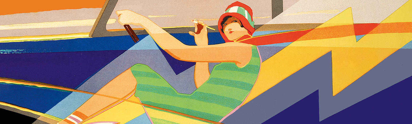
The Art of Advertising told the story of British advertising from the mid-18th century to the 1930s through an incredible collection of handbills, trade cards, novelties, posters and much more.

Advertisements were not made to be preserved. Their chance survival transforms them into unwitting historic documents, often revealing tiny, sometimes unexpected, details of the lives of our ancestors. Advertisements can also capture in their design the spirit of their age.

And yet… we must not forget that adverts are rife with hype and idealization. They conceal as much as they reveal. The women, men and children who smile at us from so many of these images represent an ideal, a way of living enhanced by the product being advertised.

Advertisements have other stories to tell too. Developments in printing were critical to the creation of a new form of art — commercial art — and to the generation of the wealth of striking and iconic images we now associate with the art of advertising.

Nearly all the exhibits were drawn from the Bodleian’s renowned John Johnson Collection of Printed Ephemera, one of the largest and most important collections of printed ephemera in the world.

The galleries below show almost all the objects displayed in the exhibition, including trade cards, posters and novelty advertisements. They reveal the changes advertising went through from the 18th century to the 1930s, and provide fascinating insights into British social history. We hope you enjoy browsing through the exhibition online until it reopens.

Explore more with

 Curator

Julie Anne Lambert

Advertisements were at the cutting edge of many developments in printing. For example, advertisers pushed the printing trade to create large and bold types that could be read at distance in the street, to use colour to attract attention, and to find ways of combining text and image in exciting new ways.

This case includes examples of each of the main printing techniques employed during the time period of this exhibition (1740s to 1930s). Descriptions of each process can be found in the exhibition's Brief Guide to Printing Processes. The printing process of every exhibit is included in the item captions.

Illustration was increasingly used by advertisers to provide accurate visual information about their products, enabling consumers to make choices from the comfort of their home. Although skilful, this meticulous illustrative work did not allow for inventiveness. It was rarely signed, and was certainly not considered to be art. However, sometimes the artist’s imagination would emerge, as in the large Daniel Collins trade card and the much later ‘wheel of hosiery’ from 1898, which prefigures the 1930s notion of graphic design.

Traditionally, printers used jobbing artists, whose drawings were then engraved on wood or copper or put on lithographic stone. Wood-engraving continued well into the 20th century for this sort of work, eventually to be replaced by photomechanical processes.

Colour printing is now so commonplace that it is difficult to imagine the impact it made on the poster hoardings of London in the 1880s. The facility to print in colour and at large sizes led advertisers to take not one, but two directions in Britain.

Fine Art

A. & F. Pears led the way in appropriating fine art to promote their brand. After their first success in 1878 with ‘You Dirty Boy’ (a sculpture commissioned from Giovanni Focardi), Pears’ next venture caused outrage in the art world. By adding a bar of soap, the brand name and a new title (‘Bubbles’) to John Everett Millais’ painting, ‘A child’s world’, Pears called into question notions of copyright and integrity in reproductions of existing paintings. Although Pears had Millais’s permission, the trend was set, and not all advertisers had the consent of the original artist.

Commercial Art

A new approach can be seen in H. Stacy Marks’s ‘Cleanliness is next to godliness’ but it wasn’t until 1893 that Dudley Hardy created the first British ‘artistic’ poster, (see Postermania). The British commercial style became characterized by thick dark outlines, flat bold colours and a gentle humour. The examples shown here are by Dudley Hardy, John Hassall and Tom Browne.

To get their message across to potential customers, advertisers used a wide variety of formats, varying in size from newspaper inserts to billboard posters. Their targets could be the readers of a journal or a local theatre audience, passers-by or the chance recipients of an advertisement dropped from a balloon.

Handbills (often reductions of posters) were distributed in various ways: by hand, in shops and sewn within the pages of journals. The postal service enabled targeted advertising to customers, through circulars, postcards and stamp posters.

Text, typography, printers’ ornaments and images could be used in striking ways to attract and retain attention. The juxtaposition of strong colours was also effective.

Shop window displays were important in enticing customers. Hanging cards, shelf ends and display cards helped to present merchandise attractively. Shops also commissioned their own stationery, such as bill headings and price lists.

The more innovative manufacturers found novel ways of promoting their wares through a whole range of gimmicks, some of which are shown here. The more outrageous the better! Slogans were powerful too, the more so when taken up by other media, as in Pears’ slogan “He wont be happy ‘till he gets it”.

Toys and other giveaways, both educational and recreational, brought children into the competitive world of brand loyalty.

Free gifts that would be kept and used ensured that brand names remained in sight and therefore in mind. Most giveaways for adults had practical uses (blotters, calendars, etc.) or enhanced leisure hours. Cards distributed with branded products, such as cigarettes, were eagerly collected by adults and children alike.

From simple flap advertisements to intricate pop-ups, these late-19th-century die-cut novelty advertisements must have delighted the public.

The international poster scene was well established by the time Britain’s first ‘artistic’ commercial poster, Dudley Hardy’s ‘yellow girl’ for To-day magazine, burst onto the streets of London in 1893. There was a flood of artistic creativity, and posters became familiar through their use (at reduced sizes) for advertisements and prospectuses. Despite the late start, British posters were well represented in international books, journals and exhibitions, but the mania for poster collecting was short-lived.

A changed Britain emerged from the aftermath of WW1. Advertisements with bright colours and bold designs mirrored the country’s fresh optimism and determination to enjoy life.

For women, there were shorter hairstyles and hemlines and changed expectations. Both women and men practised an increasing range of sports. But it was emerging technology that was to have the longest-lasting impact on lifestyles – and on graphic design. Radios, telephones and television expanded horizons within modern homes as much as bicycles, motor cars, cinema and foreign travel did outside them.

From itinerant tradesmen to mail order, from a ‘Temple of Fancy’, where only the affluent could browse, to the first purpose-built department store, the notion of shopping has always evolved and continues to do so. In this case, we explore some of the ways in which tradesmen promoted their wares and ensured that customers went to the ‘right’ shop.

Health was big business. Some manufacturers advertised cures for an alarming range of illnesses. Some preyed on fear – of the plague, typhoid, cholera, diseases of the lungs and, in the case of Blackham’s Vegetable Tonic, of death itself – while others preferred to portray the beneficial effect of their products, from tooth powder to electric corsets. The health-giving and nutritional properties of certain foods and beverages were promoted – notably cocoa. In a competitive and unscrupulous market, packaging played a major role in ensuring that the customer bought the ‘right’ product.

The small Caxton item of c. 1477 is arguably the first poster as well as the first British printed advertisement, due to the phrase ‘supplico stet cedula’ (please leave this notice in place). Later, the ability to be read or viewed at a distance became an intrinsic element of posters (for example, the Lottery poster in the Printing Processes case).

By the age of the ‘artistic’ poster, the advertising message was usually conveyed by strong images integrated with minimal text. These four posters contrast the ornamental style of Walter Crane, the minimalism of the Beggarstaffs, the Jazz Age optimism of the anonymous poster for the new Morris-Oxford Six and the more sombre modernist abstraction of Edward McKnight Kauffer.

War provided an opportunity for advertisers to associate their products with patriotism, catching the popular feeling associated with a particular military campaign. The mood of the country might be brimming with confidence and bravado, or with something more sombre. Military heroes were celebrated around the time of the Second Boer War (1899-1902). During the First World War, paper shortages meant that catalogues were functional: most advertising was within newspapers and magazines.

Andrew Clark (1866–1922), a historian and Church of England rector, was a keen collector of day-to-day information that he thought might be lost and forgotten. During WWI, he began a new project, looking at language and its change across the war, using popular sources, especially newspapers, advertisements and ephemera as evidence. These scrapbooks are preserved in the Bodleian.

The British class structure often underpins advertising. Manufacturers wanted to associate their products with certain (usually wealthy) social groups. Even humdrum products such as cleaning materials were elevated by association with elegant interiors, beautiful women and smiling, well-fed servants.

It was unusual to show the ‘Misery’ of laundries not equipped with cold water soap or to depict true poverty, as in F. Allen & Sons’ handbill.

The children in both the Huntley & Palmers and B.T.H. Edison advertisements radiate entitlement and an unquestioning expectation that the class system would continue unchanged. Many (but not all) of these assumptions were swept away in the aftermath of the First World War.

British firms often used national symbols as marketing tools. As well as images of royalty, patriotic iconography included the Union Flag, the Royal Standard, John Bull, Britannia and a range of quintessentially British uniformed officials, including policemen, yeomen of the guard and naval officers. Scotland was evoked by the kilt or full highland dress, Ireland by the shamrock or just the colour green.

Attempts in the early 1900s to sell products from the colonies, such as Australian ‘Orion’ wine with its government certificate, culminated in the establishment of the Empire Marketing Board in 1926.

Images of royalty boosted sales, especially at times of national celebration, such as coronations and jubilees. Even manufacturers without royal warrants hoped to gain commercial advantage through perceived connections with royalty. The examples in this case represent reigns from William IV to George VI.

The Great Exhibition of 1851 symbolized optimism, pride and nationalism, yet was coupled with unprecedented internationalism. Advertising was focused mainly on promoting inventions in an attempt to secure a much-coveted medal, illustrations of which became a feature of later advertising. The exhibition spawned a wealth of souvenirs.

Opportunists, such as Folkard and Samuel Brothers, created adverts that capitalized on the popularity of the Exhibition to draw people to their London shops.

The predominance of images of women in advertisements is not only due to the selling power of a pretty face. Women usually controlled the domestic budget, so were the obvious targets of advertisers. The adverts in this case chronicle the pressures placed on women to follow the dictates of fashion: from the silhouette of the time to long (but styled) hair and flawless complexions.

New possibilities gradually opened up for women even before World War I. The ‘New Woman’ of the 1890s cycled and engaged in energetic sports. Hemlines rose just a little to facilitate these activities. As the century turned, women continued to push towards more independence, challenging ideas of respectability. Advertisers were quick to reflect this and boost sales.

World War I radically changed women’s place in society. Practical wartime adjustments to hemlines and short hairstyles became permanent, liberating trends in post-war fashions. Votes for women followed the war, and women entered the job market – a route to independence.

Advertisements collected in the past can be a mine of information for historians, and often provide snapshots of moments in the past in a way that more formal publications do not. These Oxford trade cards, circulars, advertisements and paper bags are representative of the importance of advertising to local historians, including illustrations of demolished buildings, premises before alterations and records of addresses that no longer exist. They also give us insights into what was sold locally and into the social, commercial and cultural lives of past generations.

Celebrity culture is nothing new. By the 1880s, the public were familiar with images of the famous through theatrical and military prints, popular music and ceramics. At the same time, there was a well-established practice of using testimonials in adverts. Combining these was the master stroke that created celebrity endorsement.

Military heroes, living and dead, were also fair game, adding cachet and gravitas to brand names. The smoking Craven “A” aviator was a more generic symbol of heroism.

In peacetime, politics rarely intruded openly into advertising. However, several examples shown here capitalize on discontent, hardship or political events to grab public attention and engage sympathy before proceeding to promote their wares.